
Quick view feature for Priceline Pharmacy
UX | RMITO | FIGMA
As part of the RMITO User Experience (UX) design course, I identified a hunch for Priceline Pharmacy and using the double diamond deisgn process designed a Mid fidelity prototype
Project overview
Project background:
Reflecting on my personal experiences, I picked up an online shopping experience which I can use rty to address using the UX methodolgy. I decided to to go ahead with Priceline Pharmacy website and using the double diamaond desigbn process was able to come up with a potential solution.
Duration:
6 weeks - 22 May 2022 to 03 Jul 2022
My roles & responsibilities:
UX design, Competitor analysis, User interviews, Affinity mapping and wireframing
Project outcome:
Click-able, Mid fidelity prototype
Project presentation:
The project journey along with the project outcomes was presented to the stakeholders via a 10 minute video presentation.
Details of the project is documented in the subsequent sections.
Double diamond design process
Discover > Define > Develop > Deliver
Reflecting on my personal online experiences, I choose to address some issues I had encountered on the Priceline Pharmacy website. I wanted to use the UX methodologies to see if my concerns were shared by other users and was there a potential solution.
For this, I used the Double diamond design process. The big idea in the Double Diamond is that the problem is just as important as the solution.
So, i started by defining my hunch and then working my way through the process until i had narrowed down to a specific solution

Define problem
What is my hunch
I am a Priceline Customer. I love the in-store experience. They have a large variety of brands and store a great range of products at affordable prices. Everyone loves a good Sale and PRiceline sure knows how to do them.
But the Priceline online experience is quite a different story. The website looks busy with so many promotions and blog posts striving for attention. There is endless scrolling and no easy way to reach back to the top of the page.
Searching for a product reveals plenty of option to choose from, which is great. They also have a filter and sort option on the search result page. However, to browse the available product, you need to go back and forth on the pages clicking in the browser, which is quite frustrating and time consuming.
Hunch :
Users might find it difficult to purchase a beauty product because of the time and effort required to make an informed choice.
But who is this user ? I was finding it quite hard to remove myself from the users shoes and look at the problem objectively. I realised it was False-consensus bias.So, to help me with my bias, I created Sarah , my user persona and started to work towards creating a richer shopping experience for Sarah.

Desktop research
What does the existing research indicate
To understand how other companies, in the similar line of business, were selling their products online. I undertook 2 types of desktop research - Landscape research and Heuristic evaluation.
Landscape review :
I undertook a landscape review of Priceline’s 3 competitors - Chemist warehouse who is a direct competitor selling pharmacy, Beauty and health. And Sephora and Mecca who specialises only in beauty products. I reviewed each website under 5 categories - first impressions, ease of navigation on the webpages, key features enhancing the user experience, display of product information and support and guidance for users in product selection.

Outcome of the landscape review:
-
There is too much scrolling on the pages
-
As compared to others, the Sorting option is not the best
-
Product information is inconsistent
-
There is not much support available for the customers
This validated my hunch that finding a product on Priceline website requires a lot of effort and is a time consuming process.
Heuristic evaluation :
As my hunch revolved around usability issues on an existing website, I was keen to see how Priceline performed under a Heuristic evaluation . For this I reviewed the Priceline website against a set of questions which were built on the 10 Heuristic principles.

Outcome of the Heuristic evaluation:
-
There is too much scrolling, resulting in user not knowing where they are on the page ( #1 Visibility of system status)
-
There is lack of proper classification on the products page, creating a cluttered and disorganised view of the products (#8 Aesthetic and minimalist design)
-
The user does not know how many more steps are required to complete the task ( #1Visibility of system status)
-
.The user does not know the shipping costs and terms around especially free shipping for purchase over $50 ( #10 Help and documentation)
The review revealed certain areas which were not very user friendly. There were areas which can be relooked at to enhance user experience. This helped me further validate my hunch .
Next, I needed to speak with the users to understand their experience while buying product online
.
User research
What does the user feel
User Interview:
I conduct a Qualitative UX research to understand more about the users feelings and experiences while shopping online, for beauty products. Defining the objectives before the interview, helped me develop the right set of questions for the interview.
Objective 1:
Understand the various mediums through which users search a beauty product
Objective 2:
Uncover participants’ thought processes and prior experiences before buying beauty product on a website
Objective 3:
Identify any problems or barriers they encounter while buying a beauty product online
Based on these objectives, I created a detailed interview guide interviewing users on their online shopping experience in general and also on the Priceline website. It was a great experience listening to how diverse each users experience was and at the same time they faced similar challenges.

Affinity mapping:
IPost the interviews, I went through the recordings, paper notes and the audio transcript to analyse the interview. I chose the Affinity mapping technique to synthesis the data and draw insights. After grouping the interviewee data, I was able to identify 13 insights around Product information and Buying behaviours. Entire process from Interview Analysis to Recommendations was done in MIRO.
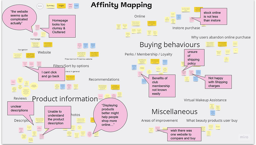
Insights and recommendation:
The 13 insights from Affinity mapping, were grouped further, based on the similarity of ideas. I was able to derive 6 Key Insights and recommendations for each of those Key insights, which are summarised in the below table :

In my opinion, addressing issues relating to product information would be easier to implement in comparison to addressing issues related to buying behaviour.
Thus, the focus of this project narrowed to 3 insights and recommendations related to Product information.
Recommendation 1:
Explore ways to include realistic information about the beauty products on the website
Recommendation 2:
Explore how we can get reviews for beauty products
Recommendation 3:
Explore ways to enhance the navigation experience
Ideation
What are the potential solution ideas
I took time to decide which ideation technique would suit best for this particular case. With so many insights and recommendations to work on, I thought a technique which will help me generate multiple ideas would work best. I decided to go ahead with Crazy 8s on the top 3 recommendations. It was wonderful to let loose and get the creative juices flowing. At the end of the ideation process I had 24 concept ideas to work on.


Prioritisation
Which idea to pick
Reviewing the 24 concept ideas generated doing the crazy 8s, there was not a clear concept which I would term as the winning idea. So I decided to undertake 2 stages of prioritisation to ensure that the most viable as well as effective concept is identified.
For the first stage of prioritisation, I chose the effort vs impact or the 2x2 matrix. I wanted to find out ideas which can be implemented quickly and at the same time given highest upgrade in the user experience.

I was able to narrow down to 7 ideas using the Effort vs impact matrix. In the second stage of prioritisation, I decided to review these 7 ideas using the User centred design framework (UCD).
Each idea was evaluated for its merit on desirability, viability and feasibility and given a score from 50, to help shortlist the idea which if prioritised can enhance user experience.

Prioritised concept:
Quick view on images instead of leaving the page and going onto the product page. Reduces back and forth navigation
Reasons for prioritising the above solution idea:
-
One of the common themes across the user interviews was that users need a better view of the product and more product information to enhance their online experience. Direct quote from user “displaying products better might help people shop more online”
-
The Effort vs Impact analysis revealed that the above idea was was high on impact and low on effort, making it a Quick win !
-
Under the UCD scoring, the above idea was scored the most under all the 3 categories - Desirability, Feasibility and Viability
-
This solution addresses my initial hunch, by making it quicker for users to see the product before moving forward in the buying journey.
Low fidelity prototype
What will the user flow look like
The idea which will be able to deliver most on user requirements as well as the business needs was to introduce a Quick view option on the product image. This will let the users stay on the product results page while seeing the product information.
Before moving forward, I wanted to check the user flow and create a draft design on how this solution might possibility look on the website. So i first designed the user flow as a Paper prototype.
Step 5: Add the eyeliner to the cart
Step 1: Open homepage

Step 2: Use search bar on home page to search for eyeliner

Step 4: Hover over the chosen eyeliner to generate the quick view

Step 3: Browse the search result

Step 6: Proceed to checkout


Once the user flow looked right, i translated the paper prototype into a Low fidelity prototype in Figma

Usability testing
What do the users think of the new feature
With a clickable low fidelity prototype ready, next step for me was to conduct a usability testing to see how the users felt while using the new feature.
I defined goals for the usability testing to help me determine what type of testing would work best.
Goal 1:
Understand how users search for a new product via homepage
Goal 2:
Understand how users browse the search results page
Goal 3:
Understand user feedback on product information pop up window
I decided to go ahead with a Moderated remote testing. This interview session was bit different from the previous one. Here there was a specific goals in my mind - How are the users going to use the new feature and will it help them. So i created a interview guide with 5 tasks which the users had to perform on the low fidelity prototype.
The tasks performed by users were:
-
“For the first task, I’d like browse the web page and walk me through how you would look for a new eyeliner”
-
Follow-up Question: Did you find the task easy or difficult to complete? Is there anything you would change about the homepage of the website?
-
-
“For the second task, I’d like you to use search bar to see if you can find the eyeliner options available ”
-
Follow-up Question: Did you find the task easy or difficult to complete? Is there anything you would change about the process of searching a product?
-
-
“For the third task, I’d like you to browse the search result page and decide which eyeliner you would pick and why
-
Follow-up Question: Did you find the task easy or difficult to complete? Is there anything you would change about the process of choosing from the search result?
-
-
“For the fourth task, I’d like you to click on the eyeliner which is on Half price to review the information “
-
Follow-up Question: What are your thoughts on the information which popped up when you clicked the eyeliner ? Is there anything you would change about how the information is presented?
-
-
“For the final task, I’d like you to add the eyeliner to the cart and proceed to checkout”
-
Follow-up Question: Did you find the task easy or difficult to complete? Is there anything you would change about the process of checkout?
-
I recorded their navigation to see the path they followed and also noted the points they raised while using the prototype. It was wonderful to see user reactions to the new feature.

The interview data was captured and synthesized using the TRELLO board. This helped to quickly identify the issues highlighted during the testing and prepare for an action plan

The usability testing gave 9 insights out of which 7 directly related to the quick view feature. These insights were very helpful in fine tuning the quick view feature. The other 2 insights might be interesting to address as part of future projects.


Reviewing the insights related to the Quick View feature, I needed to incorporate 3 sub features into my medium fidelity prototype - allowing users to use the navigation bar for product search and not just the search bar, Allowing users to close the the quick view window and return to the search results page and finally adding the checkout process to the flow as the users wanted to know the shipping, which is an existing feature on the checkout page
During the user interviews, I also got the users to respond to the System Usability Scale questionnaire. This was to supplement the decision of taking up Quick view as a idea for moving forward. The idea was graded A , best imaginable under the SUS score calculator. This gave me the confidence i needed to move my low fidelity prototype to a mid fidelity prototype.

Mid fidelity prototype
How will the new feature work
I incorporated the actions from the insights into the low fidelity prototype and created the Mid Fidelity prototype.
The user flow for this prototype is to :
Search for an eyeliner > Browse the search results > Select an eyeliner to see its details >
Add to cart > Checkout

My learnings
Miles to go before I sleep...
-
Great things are never done by one person - I quickly realized that all the theory was not enough for me to move along this designjourney. Feedback from mentors, Encouragement and brainstorming with peers was very crucial
-
We all have biases - I surprised how hard it is to be able to think objectively especially when you are also a user experiencing the problem. We are so conditioned to find a quick fix.
-
We are all work in progress - Every moment brings in an opportunity to learn and grow. With more experience, I am sure I will be able to do things more efficiently and effectively
Thank you for reading this case study.
Feel free send me an email to connect or discuss more on my work.